
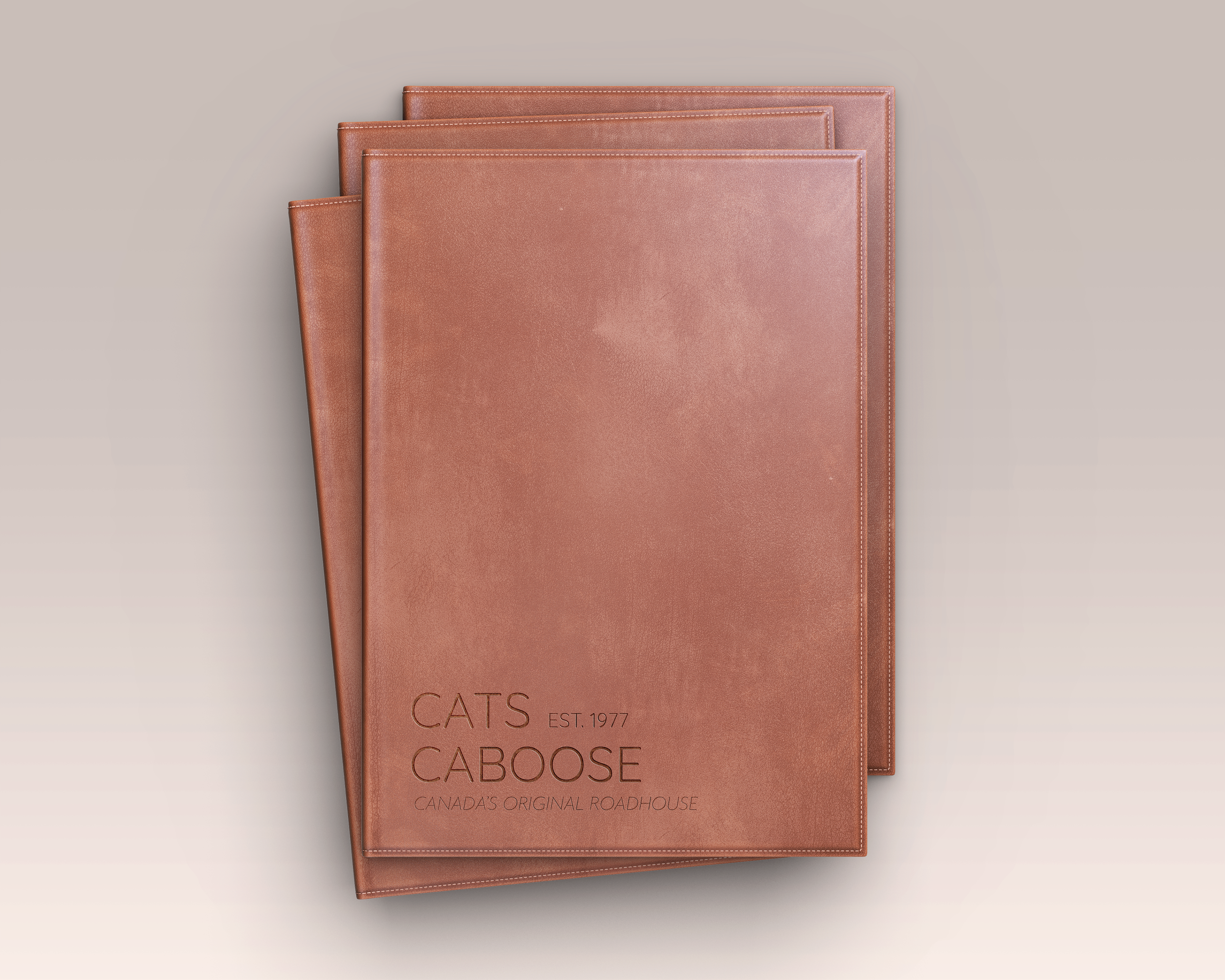
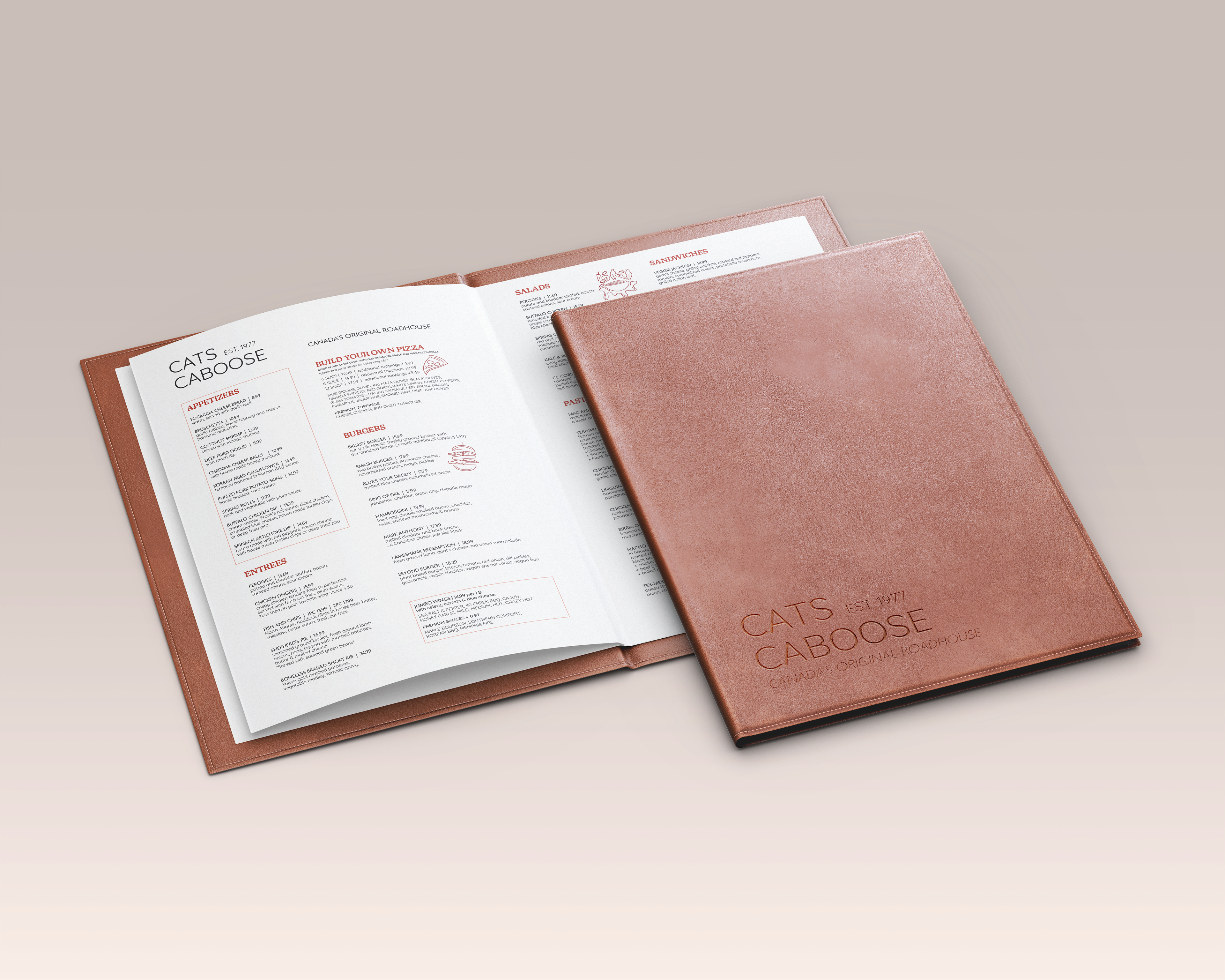
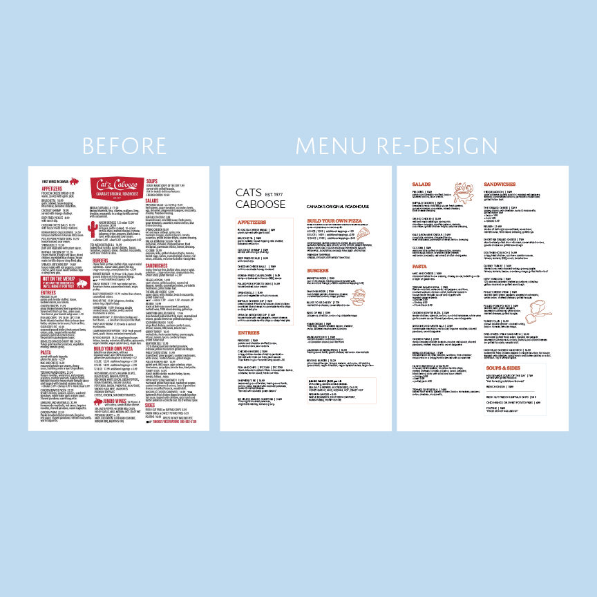

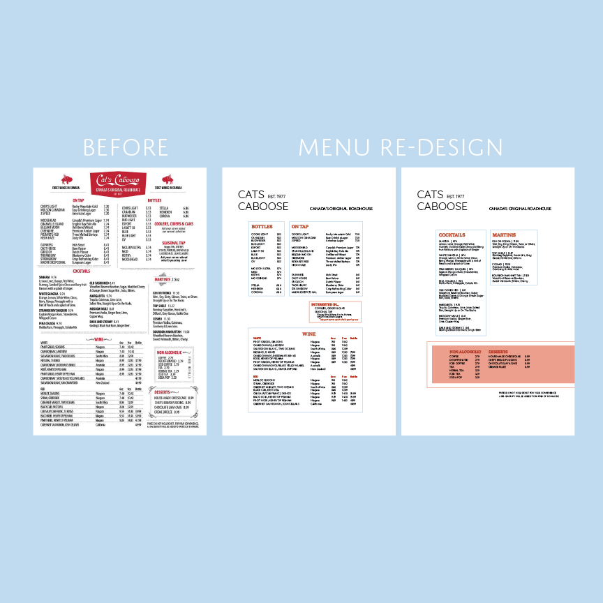
Project: Re-design Cats Caboose Menu
Process: I recently went to a restaurant with my friends (Cats Caboose), and immediately noticed the menu design - it was NOT easy to read. The words were just jumbled together. It was hard to make sense of it and it was not easy to know where to look. It wasn't clear where one section ended and another one started.
ISSUE 1: Space...
Space is such an important factor when displaying written information for the consumer. You want it to be an easy experience for your customer and without the proper amount of space in any menu, it won't be. It is just as problematic to have too much space as it is to have too little.
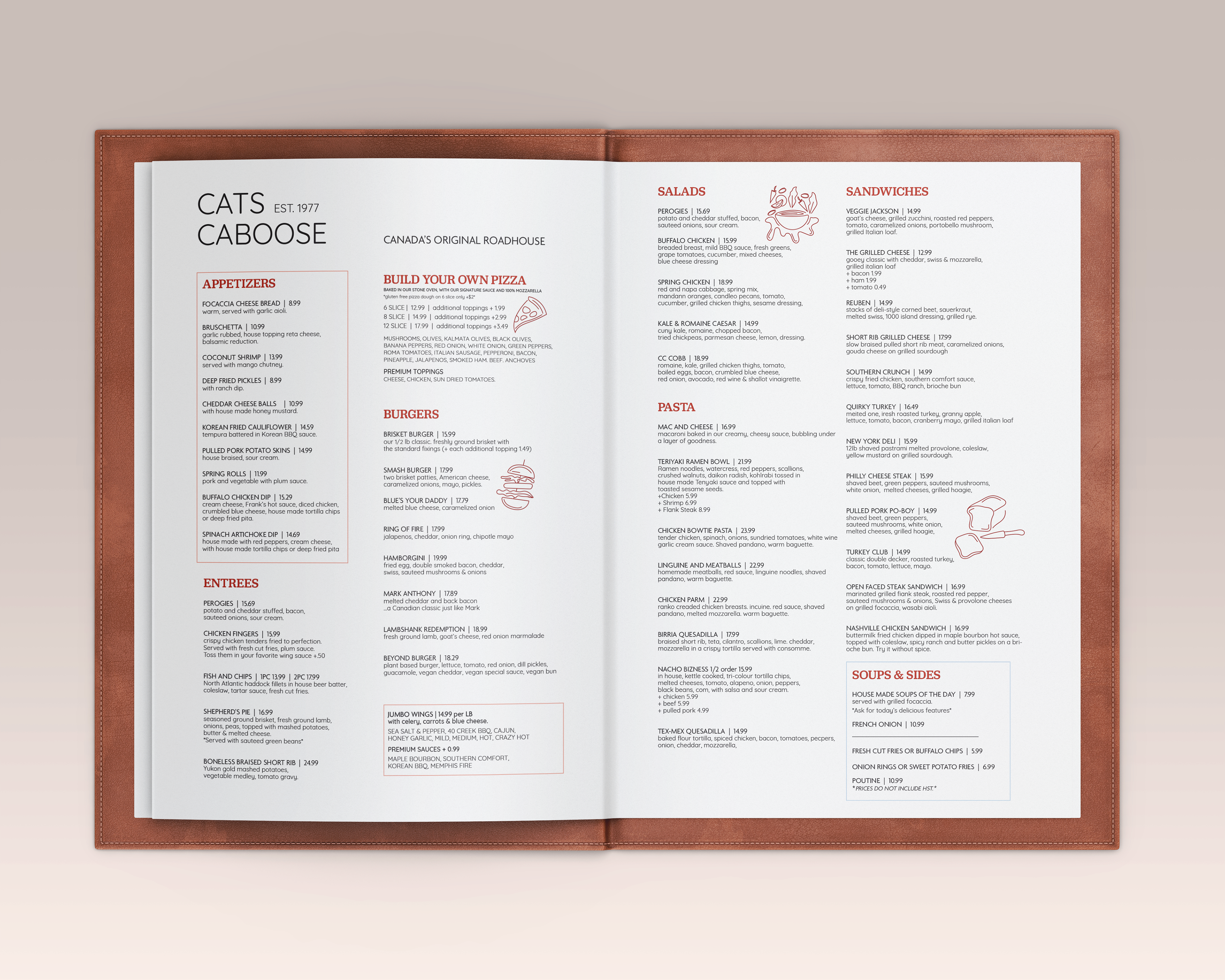
In my menu re-design, space was prioritized, even if that meant more printing required. You can clearly see the use of space in my menu design in comparison to what they had before.
ISSUE 2: Not enough differentiation between typefaces...
Their typography did not differentiate enough between categories (ie. product name vs product description). This made it hard to read and interpret. This was modified and corrected in my menu design by using clearly different typefaces & styles for different bodies of text (ie. uppercase typeface for product names, different lowercase typeface for product descriptions) while maintaining a clear consistency from category to category (ie. all section titles are the same font, font size and colour).
ISSUE 3: Prices were not consistently easy to find...
There was no consistency in their menu design when it came to how the prices were listed. A customer should be able to focus directly on the prices, and they should easily be able to skim through the prices listed. Being the customer, I was not able to do that. Lack of space contributed to this issue. To combat this issue in my menu design, first, I ensured I had adequate space. Second and more importantly, I consistently separated the specified price by using a line (between the name of the product and the price of the product).
ISSUE 4: Too many categories poorly displayed...
In their menu design, even though "soups" and "sides" were the smallest categories, they were separated for no reason. I fixed this by grouping them together, while still clearly defining the products belonging to each category. Their menu was just poorly designed in terms of layout. The category "pasta" was spilling over onto the next column, making it hard for customer to still mentally assign those products to the "pasta" section. This could have been easily avoided had they moved around their section titles. I corrected this in my design by minimizing the quantity of sections or grouping similar ones together - ie. jumbo wings did not need to be an entire new section, nor did soups or sides (when on their own). In my design, jumbo wings is on its own, but it did not need a large section title. I emphasized this small product choice by boxing it in, drawing the customer's eye to it, which signifies that it is a single product (not a section). I boxed in appetizers as well, as it is always the first thing in any menu and remains different from all the "actual meals".
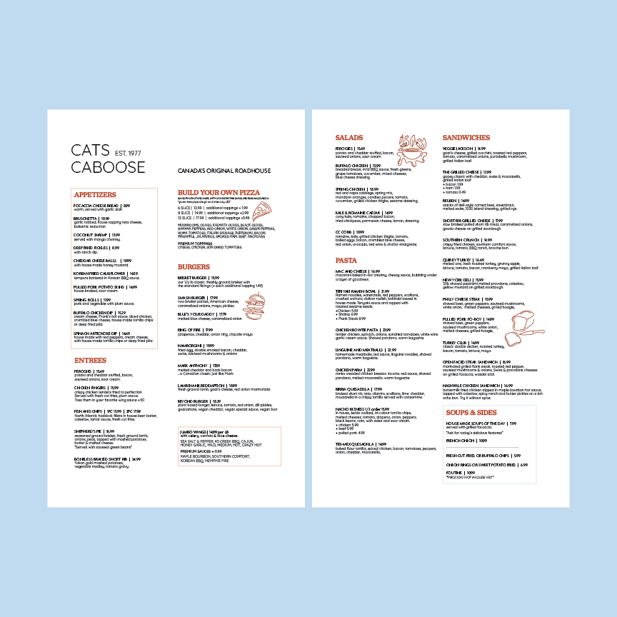
Before: It was an extended (long) double-sided one-piece menu.
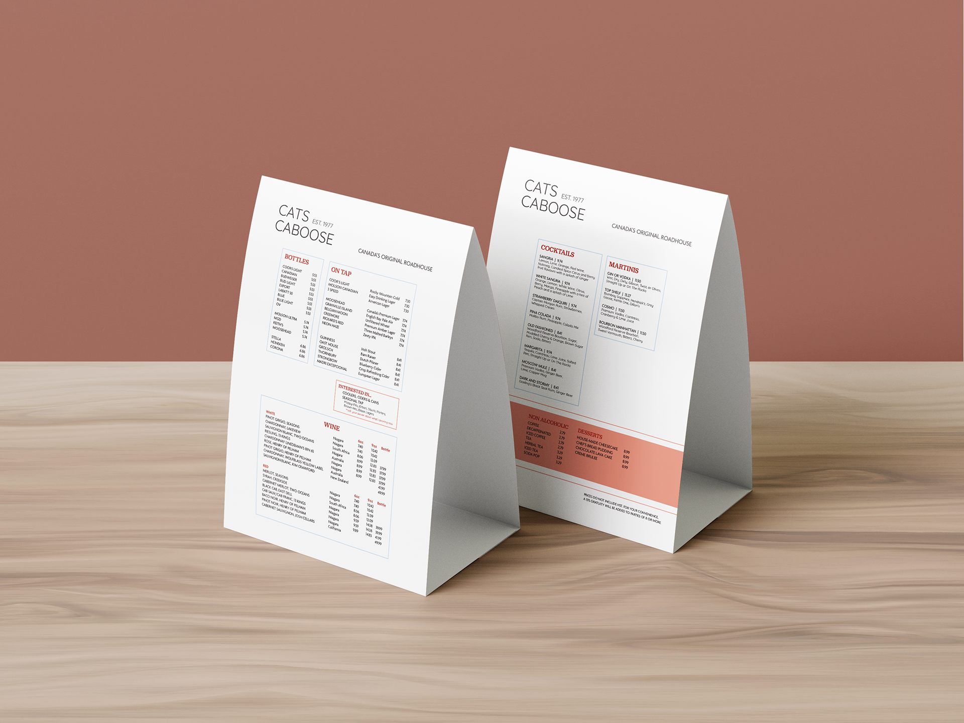
After: Two shorter menus - one for meals (to be handed out to each customer) and one for drinks (to be placed on each table rather than giving a drink menu to each customer).