
Company Description: This is a sugar free chewing gum brand that’s exploding with flavours! They want a brand identity that will set them apart from the competition.
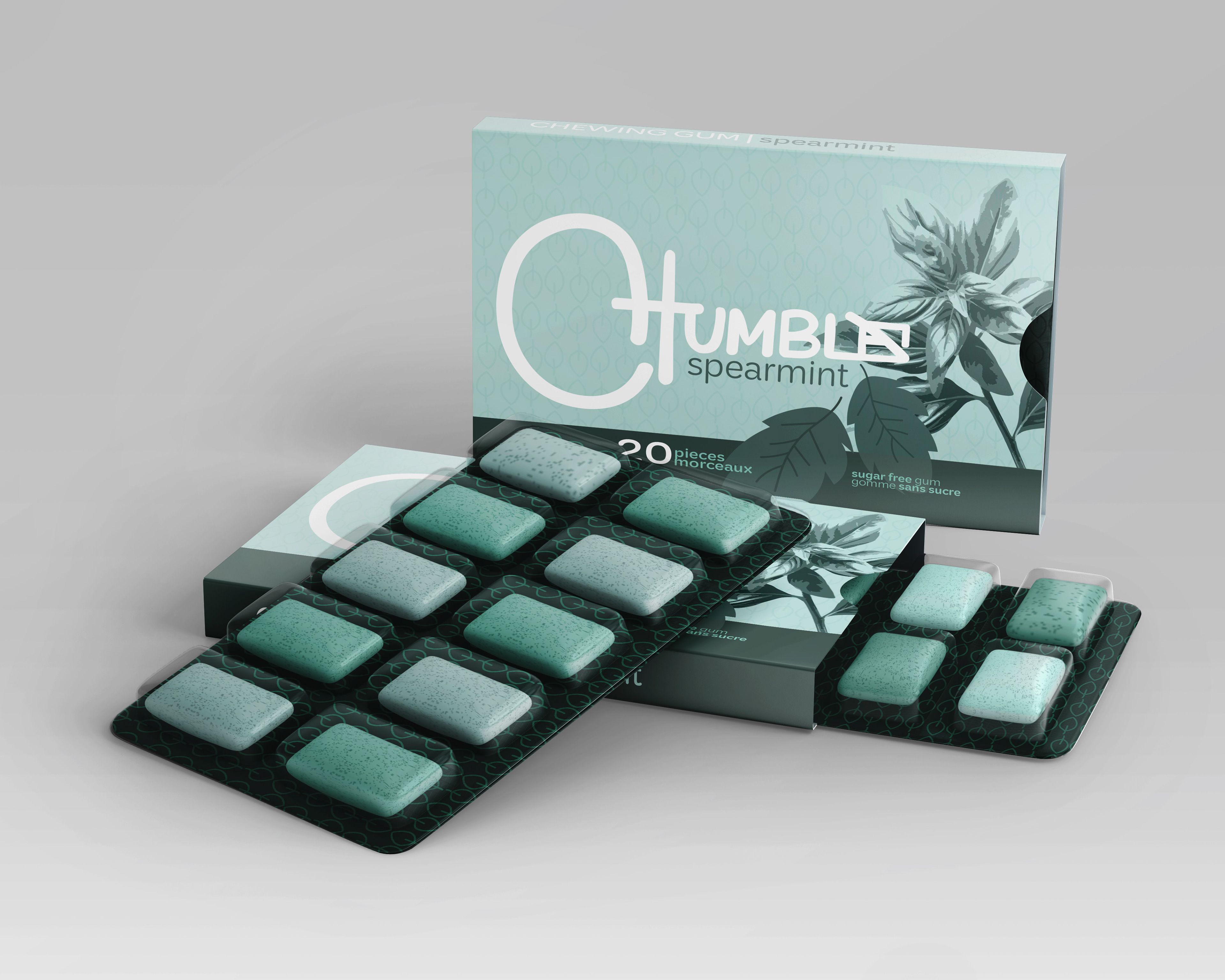
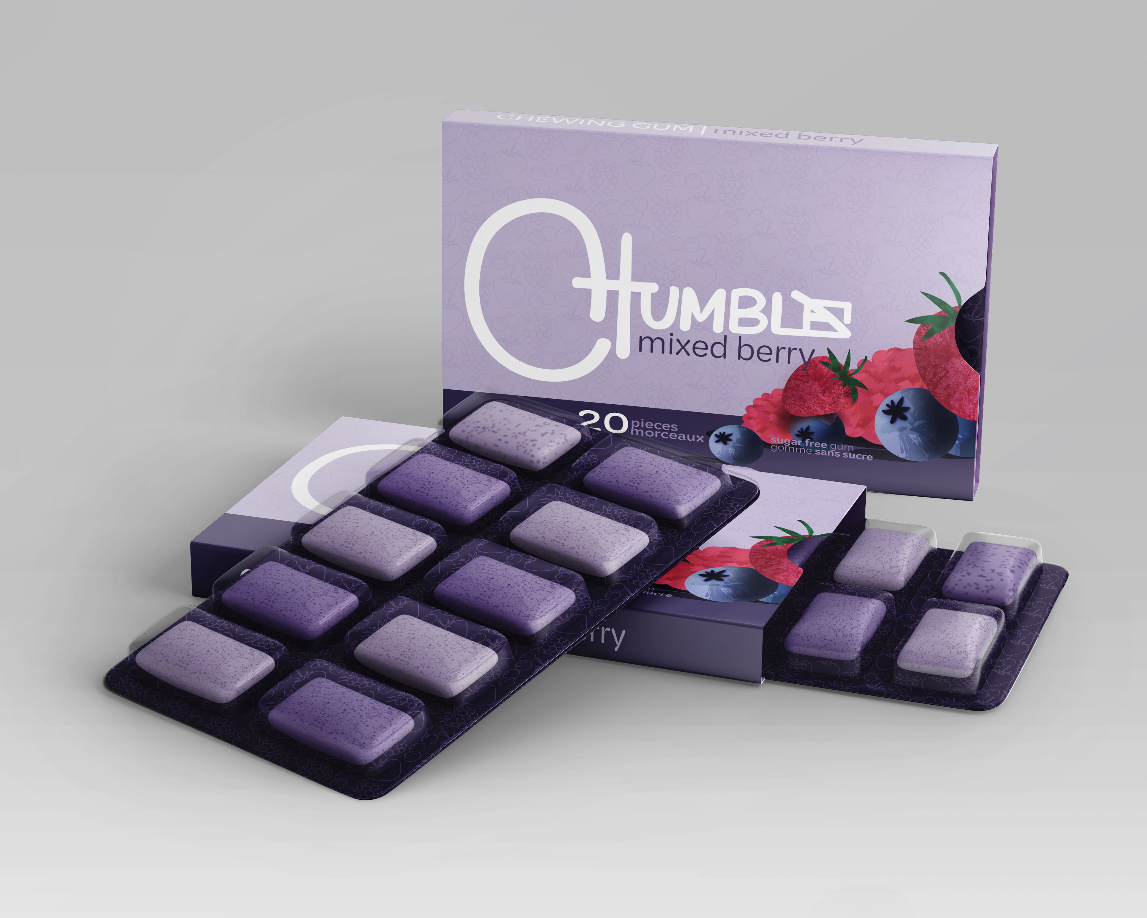
PACKAGING DESIGN: I analyzed trends among gum packaging determining an overuse of bright bold colours, chunky fonts, high contrast and a lack of pattern. Aesthetics can be a personal opinion to the observer, however even so, I noticed that the majority of gum packages are simply trying to grab your attention by utilizing bold colours and do not display aesthetics efficiently. This gave me somewhere to start to set this brand apart. Instead of the bold colours used in packaging to grab your attention, my goal was to draw the eye by being the package that’s the more muted odd one out, so to speak.
Including the use of pattern in my package design, sets it apart from the well known gum brands like Trident, Extra and Eclipse. As seen from my two package variants, the patterns differ matching each flavour (leaves for mint, and berries for mixed berry). This difference of pattern can be seen in the foil of the packaged gum and the background on the front of the boxed packaging.
Including the use of pattern in my package design, sets it apart from the well known gum brands like Trident, Extra and Eclipse. As seen from my two package variants, the patterns differ matching each flavour (leaves for mint, and berries for mixed berry). This difference of pattern can be seen in the foil of the packaged gum and the background on the front of the boxed packaging.
LOGO: setting this brand apart involved staying away from chunky bold fonts, something that makes all gum brands overly similar. Instead, this logo offers a smoother, curvier identity, specifically the over-curved C visually representing the popular term “blowing a bubble” associated with chewing gum.
In addition, the design decision to box in the “e” at the end of Chumble was due to analyzing how sugar is simplistically represented, things like icons. It was often shown in the shape of cubes (sugar cubes), so I incorporated a square into the E with a line through it to visually represent the idea that this gum is SUGAR FREE.
In addition, the design decision to box in the “e” at the end of Chumble was due to analyzing how sugar is simplistically represented, things like icons. It was often shown in the shape of cubes (sugar cubes), so I incorporated a square into the E with a line through it to visually represent the idea that this gum is SUGAR FREE.